role: user research, ux & ui design
disclaimer: this is a hypothetical redesign created for the User Experience Design at NYU. This project is not affiliated with the yale school of art.
disclaimer: this is a hypothetical redesign created for the User Experience Design at NYU. This project is not affiliated with the yale school of art.
“yale school of art website”
01
Identify Problems Define Goals
︎︎︎
02
User Research
Define Audience
︎︎︎
03
Explore Solutions
Wireframe
︎︎︎
04
Visual Design
Prototype
Problem Overview
The Yale School of Art intentionally created this website as a wiki where all students, graduates, and staff are able to edit and modify the content. It’s an interesting experiment and art piece, but to our target audience, there are significant problems that impact user experience.
The homepage of the website bombards first time users with colors, texts, images, and most importantly, many, many choices. The two main problems about this homepage are confusing navigation and low credibility. For a user who is trying to obtain critical information on the site, the Brutalist aesthetic not only visually hinders the user but also makes the user unsure of the authenticity of the information presented.
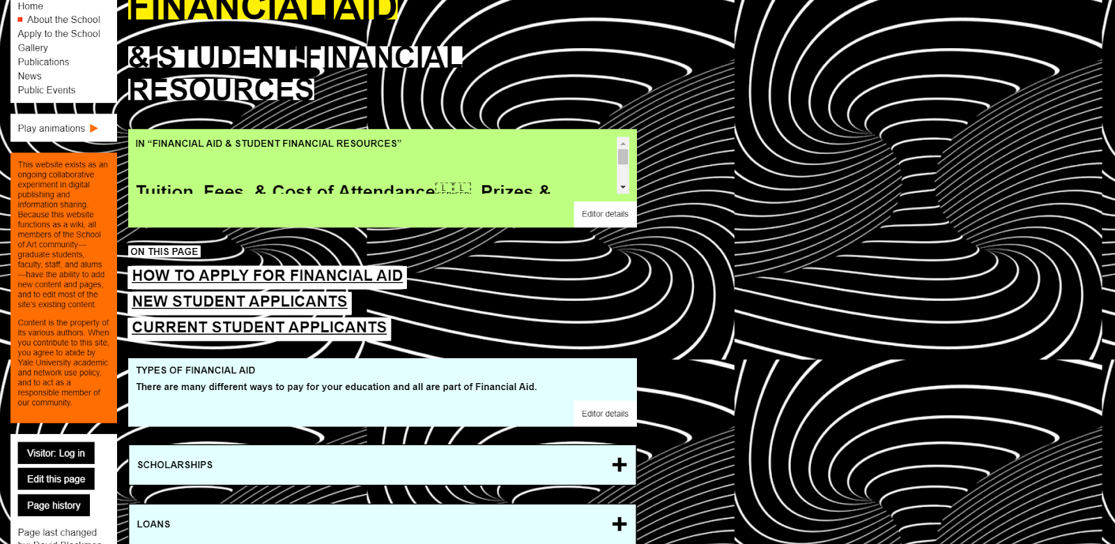
Another page of the website, which presents crucial information about tuition, students financial aid and other financial resources. The background is an animation that distracts the eyes(fortunately there is an option to stop it). The page is hard to read because of the small texts and colors that have low contrasts with the texts. This page also has some errors and is generally very unfriendly to people with visual impairments.
For Yale school of art applicants, a page containing admission information written in very dense text without prominent visual hierarchy. It’s almost impossible to find specific sections about admission information. The user likely has to read everything to find something in need.
Current Outcome
Due to the problems presented above, the audience might feel generally confused, distracted, and unsure. The website successfully creates a modern art piece but fails to address its audience. The pages generally lack clear navigation and information hierarchy, which makes potential applicants feel unwelcomed and uncomfortable. On the other hand, because of the design and colors of the website, it creates accessibility problems for people who are willing to apply to the school but have various visual impairments. Finally, the design of the website also makes people question the information credibility and authenticity. The website therefore creates a barrier that allows a narrower audience.
Desired Outcome
By solving these problems, our target audience can still experience the unique art style of the school but also be able to navigate through the website to quickly and effectively find needed information. As a direct representation of the school, the website would reflect its friendly and inclusive environment.
Hypothesis
The changes I could make include:
︎Clean up the navigation UI, especially the homepage.
︎Alter the design of color boxes and texts to increase readability but also keeping the original style.
︎Create sections for dense texts so it’s easier to read and find information.
︎Alter the structure of the pages to achieve better information hierarchy.
I believe that by solving these main issues, the website will be able to present its uniqueness through clean structure and high accessibility.

homepage
financial aid and other financial resources

admission information
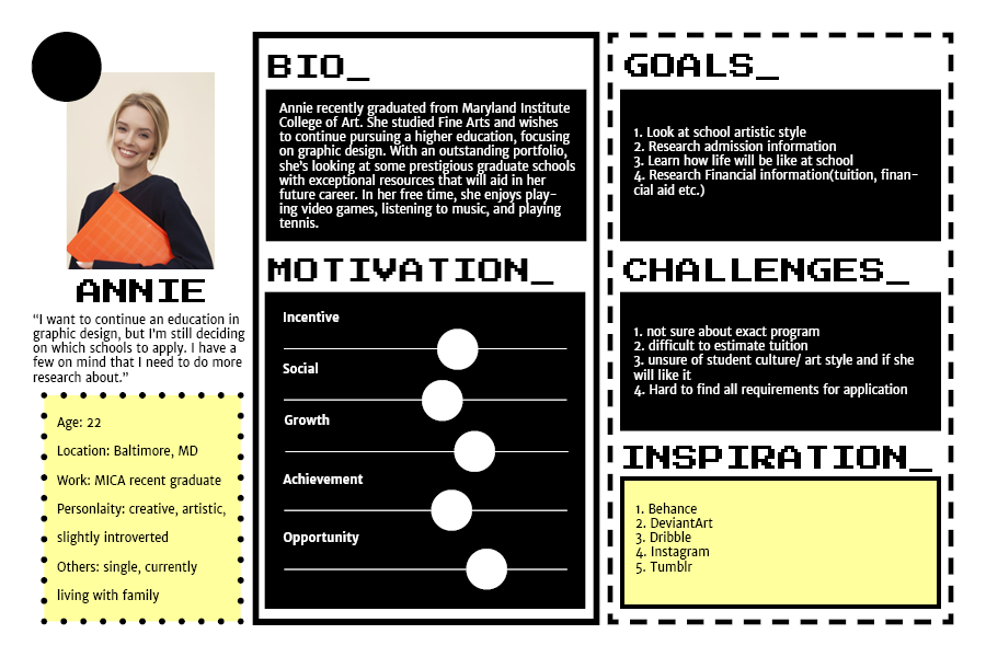
User Research: Persona
After doing interviews with people from different age groups and occupation, I created a persona for one of the primary users of the website – a potential graduate student applicant. This helps me frame a current state narrative for the user and makes me better understand the frustrations and challenges the user could encounter while using the website. By empathizing with the user, I found a clear path to a suitable solution.
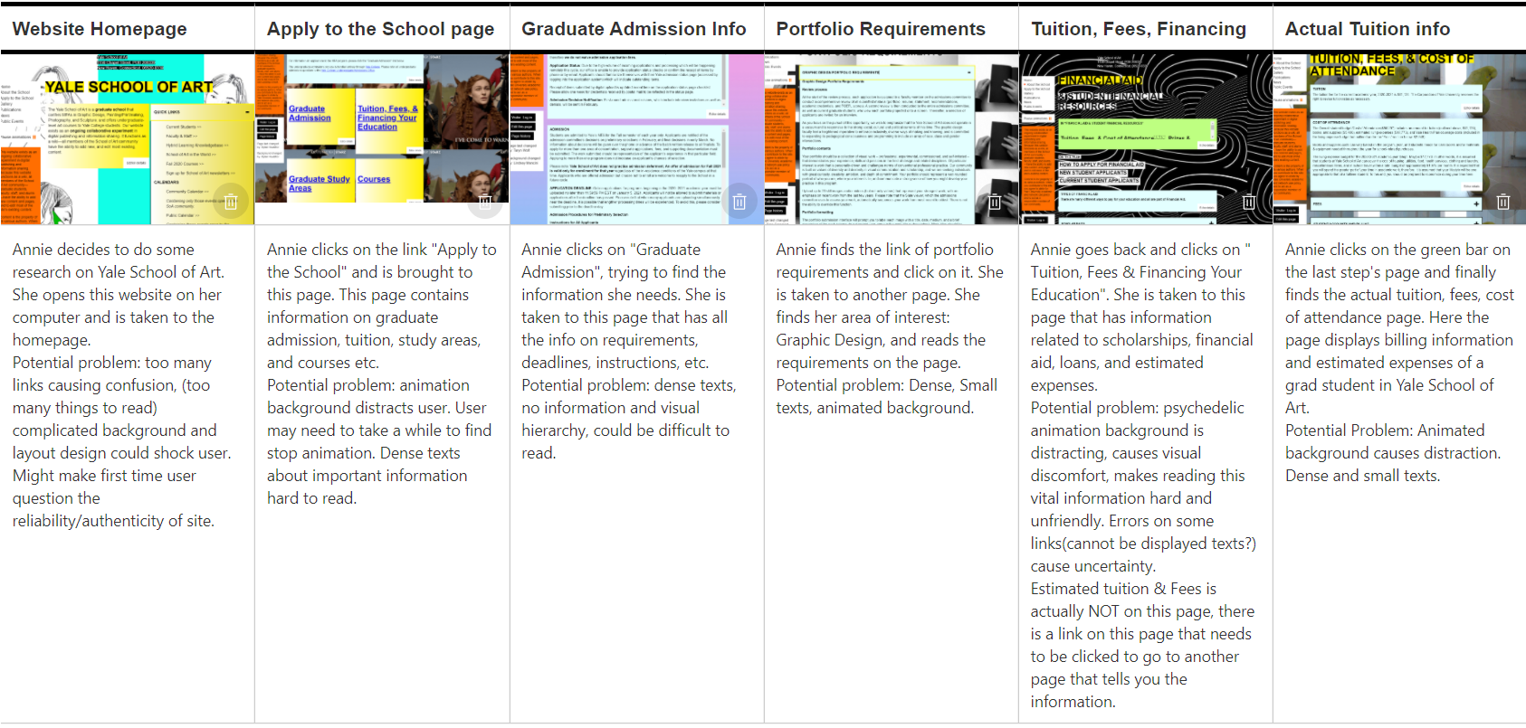
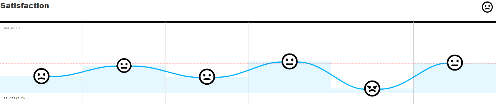
User Research: Journey Map
A journey map is crucial to understanding the details of the user’s interaction with the website. By breaking down to each step, I am able to see and summarize potential usability problems.
Design and Prototype
Visual design plays an important role in this website update. I focused on these points while redesigning:
︎ Clean, Simple Navigation
︎ Visual Hierarchy
︎ Accessibility
︎
Unique, Artistic Aesthetics


©phoebeyin